Walk into any tiled space that feels pulled together, and you are probably looking at a grout decision that was made with intention. Grout frames the tile pattern, sets the rhythm of the surface, and quietly influences how clean or busy a room feels. Get it right, and the tile looks custom. Get it wrong, and you will stare at those lines every morning, wondering why the shower suddenly reads like graph paper.
This is the decision designers sweat over far more than most homeowners realize. After hundreds of bathrooms, kitchens, mudrooms, and fireplaces, I have a simple truth to share: the right grout color starts with your goals, not the sample stick. That means deciding whether you want the tile to blend or pop, acknowledging your lighting and maintenance tolerance, and matching grout type and joint size to the effect you expect. Once you approach it that way, the color choice becomes an easy, even enjoyable, step.
What grout actually does for your design
Grout is not just filler. It defines the geometry of a tiled surface, and those lines either disappear or form a visible grid. Color shifts the eye. A tight match, like soft gray grout with pale gray porcelain, fuses the field into one visual plane. A contrast, like charcoal grout with white subway, emphasizes each tile and turns the layout into a graphic element.
There is also a practical side. Grout hides or highlights minor variances in tile sizing, absorbs some movement, and protects edges. Light grout can telegraph every speck of dust in a kitchen floor. Dark grout in a sun-washed shower can show lime scale at the joints. Durability, stain resistance, and joint cleanliness are part of the color conversation whether you planned on that or not.
Start with the three visual outcomes
When we help clients at Revive 360 Renovations evaluate grout, we ask them to choose the outcome first, then the shade. These are the three broad directions that cover 90 percent of real projects.
- Seamless field: Grout closely matches the tile body or background tone. You see texture and subtle shade differences, not a grid. Good for large floors, marble-look porcelain, and spaces where you want calm. Framed pattern: Grout is a few shades lighter or darker than the tile, enough to outline shapes without shouting. Great for herringbone, stacked rectangles, or patterned cement tile where you want rhythm and legibility. Graphic contrast: Grout intentionally opposes the tile color, like black on white. Best for retro subway, checkerboard floors, and contemporary installations where the grid is the feature.
If you are on the fence, aim for framed pattern. It is forgiving and tends to age well.
The tile’s undertone makes or breaks the match
Grout color should align with the tile’s undertone, not just its surface color. Whites can be warm, cool, creamy, or chalky. Grays swing blue, green, or brown. Beiges can lean pink. A neutral grout that fights the undertone will read off, even if it is the “right” lightness.
In practice, this means holding grout sticks directly against the tile face and its edge, and looking at them under the actual room lighting. If you cannot get grout sticks, dab sample grout paste on a spare tile. I like to test three options: one that dead-on matches the tile body, one that is two steps darker, and one that is two steps lighter. This triangle shows you how each direction plays with the undertone.
A quick undertone check that works
Place a sheet of true white printer paper and a sheet of warm cream paper next to the tile. If the tile looks dingy next to the white, it is probably warm. If it looks yellow next to the cream, it likely leans cool. Choose grout that harmonizes with that lean. This two-minute step sidesteps hours of second-guessing later.
Light, shadow, and why the same grout looks different at home
Grout reads lighter in direct sunlight and darker in shadow. It also picks up warmth from incandescent bulbs and cools under daylight LEDs. I learned this the hard way on a lake house shower with high clerestory windows. We specified a modest contrast, but the afternoon sun washed the grout almost white. The grid vanished. We adjusted on the tub surround with a shade deeper, and the pattern returned.
In Chicago rowhomes with deep floor plates, kitchen backsplashes often live under cool LED under-cabinet strips and warm pendants. That mixed light can shift a borderline grout from elegant to muddy. When Revive 360 Renovations mockups backsplash grout, we turn on all the lighting the space will use, then evaluate again at dusk. If it only looks good in one condition, we keep looking.
The reality of dirt, soap, and sealers
Designers love a clean match, but maintenance finds the https://mylestqjy657.theglensecret.com/basement-waterproofing-protecting-your-chicago-home-from-flooding truth. On floors, a light grout is a daily commitment. Even with a high-performance sealer or an epoxy-based grout, road salt, coffee droplets, and heel scuffs leave marks. On shower walls, very dark grout under hard water can show chalky deposits. On kitchen backsplashes behind a range, oil residues will settle in joints no matter how careful you are.
None of that should scare you away from the right look. It should guide you to a shade that hides what your household actually produces. If you have a dog and two kids, a mid-tone grout on a kitchen floor buys you time between deep cleans. If your shower gets hours of sun, consider a medium gray rather than true black grout to avoid chalk outlines.
Joint size and tile size change the equation
A 1/16 inch joint reads differently than a 3/16 inch joint even with the same grout color. Tight joints minimize the visual impact of contrast. Wider joints amplify it, because there is more colored area to see. Large-format tiles with tight joints can handle a little more contrast without feeling busy. Small mosaics with wide joints need a more careful match if you do not want the sheet pattern to dominate.
On a recent mudroom floor, we used 24 by 24 inch porcelain with a 1/16 inch joint. The client wanted a slight frame, so we stepped one shade darker than the tile body. It gave a clean grid without the checkerboard effect. On a 2 by 2 inch mosaic shower pan with 1/8 inch joints, we reversed that and matched closely. The floor felt calm and the slope read smooth.
Grout type matters to the final look
Sanded grout has a matte, slightly granular finish that can darken the perceived color. Unsanded grout is smoother and can read a touch lighter. Epoxy grout, the high-performance, stain-resistant option, often appears more saturated, almost like wet stone. The same swatch name can look different across these types.
If you are switching types in one room for performance reasons, like epoxy on the shower floor and cementitious grout on the wall, verify that the color codes truly match in person. Manufacturers offer cross-references, but your eye is the final judge. When Revive 360 Renovations mixes types, we stage the samples on the jobsite against the actual tile and pick a shared color that holds together across finishes.
Classic pairings that rarely miss
Design always depends on context, but certain tile and grout pairings perform consistently well because they work with, rather than fight, the material.
- White subway tile with soft gray grout: Choose a pale warm gray for a timeless framed look that hides minor wear. It feels fresh, not stark, and does not lock you into an all-black-and-white palette later. Marble-look porcelain with feathered gray grout: Match the lightest mid-tone within the veining. This preserves the slab-like effect without erasing the tile edges entirely. Textured or handmade-look tile with tone-on-tone grout: Pick a grout that matches the tile’s lightest field tone. Let the texture, not the grid, do the talking. Hex floors with medium gray grout: Most hex mosaics gain definition with a mid-gray that can absorb daily dust. True white grout on a floor will age fast. Dark slate or charcoal porcelain with deep graphite grout: A near match makes the surface read as one plane and keeps soap drips from starring the joints.
These are not rules, but they are reliable starting points if you feel stuck.
The designer’s on-site process at Revive 360 Renovations
How Revive 360 Renovations builds grout confidence
Our team treats grout selection as a mini design exercise, not an afterthought. We gather three to five grout sticks that span the outcome you want, then we create a taped tile board that mirrors your layout: stacked, brick, or herringbone. We butter a small amount of mockup grout between tiles on that board. The board moves to the space so you can see it under real conditions: morning light, task lighting, and evening ambient.
We then step back ten feet. At that distance, can you still see the pattern you liked on the countertop? If the pattern vanishes or the grid jumps out too much, we pivot a shade. In kitchens, we splash a bit of water on the test joints to simulate how grout looks when wet or freshly wiped, because that wet-darkened tone can appear daily.
The Revive 360 Renovations rule of three for tricky tiles
Some tiles fight you. Handmade zellige varies wildly tile to tile. Patterned encaustic has both dark and light fields. For those, we apply a rule of three: choose a grout that is within three value steps of the tile’s average field tone. Too light and the pattern can look washed out. Too dark and it can look chopped up. On a Lakeview powder room with green zellige, we sampled three warm grays and one sandy taupe. The sandy taupe won under both cool daylight LEDs and a warm brass sconce, and it masked the slight lippage inherent to handmade tiles.
Kitchen backsplashes: grease, light, and the grid
Backsplashes live under heavy task lighting and near oils. A high-contrast grout with glossy tile can cast tiny shadows that make wiping lines feel tedious. If your kitchen has under-cabinet lighting at 3000K and a polished ceramic tile, test a half-step less contrast than you think you want. You may still read the geometry, but the reflections become softer.
Behind ranges, a sealed, stain-resistant grout earns its keep. Epoxy grout in a modest contrast is a practical choice: it resists turmeric and tomato stains better than cementitious grout. If you are planning a kitchen for entertaining, and you want conversation rather than cleanup duty, keep the grout in that framed pattern zone where messes are less obvious and post-meal wiping is straightforward.
Showers: water, sunlight, and long-term cleaning
Shower grout endures daily cycles of wet and dry. Light grout can develop faint discoloration if not sealed or if ventilation is poor. Dark grout under hard water can show mineral deposits as pale specks. If you prefer a crisp black-and-white shower, consider a deep charcoal rather than jet black. It buys forgiveness. Pair that with a properly sloped pan, a quiet exhaust fan, and a squeegee habit, and the joints will look good for years.
In larger walk-in showers, continuous wall tile with closely matched grout creates a serene, spa-like expanse. If you want calm, match. If you want structure, contrast. For rainfall showerheads that deliver higher volumes of water, epoxy grout on floors and the first few wall courses can eliminate early staining. These performance decisions live alongside the color choice and sometimes nudge you toward a slightly different shade to keep finish consistency.
Floors: traffic, salt, and seasonal realities
Floors have their own weather. In many cities, winter brings ice melt crystals that can land in entryways and mudrooms. Those crystals dry white, and they collect in joints. A mid-tone grout on those floors hides the residue until the weekly clean. In households with pets, claws tend to kick up fine dust that drifts to corners and grout lines. Medium-light grout with a warm undertone disguises this better than white.
Open concept vs. traditional layouts affects the call too. In a continuous great room with a tiled hearth zone and a tiled kitchen, matching grout across both can calm the sightline. In a traditional plan with defined rooms, you can shift grout shade room by room to fit the mood. A family-friendly kitchen can use a utilitarian mid-gray grout, while a more formal dining room hearth might get a tone-on-tone match for elegance.
Small spaces and how grout changes scale
In small baths and galley kitchens, grout lines can either chop up the space or expand it. Tone-on-tone grout on walls and floors creates an airy, continuous surface that reads as larger. It is one of the easiest tricks for small Chicago homes where every square foot counts. If you crave pattern, limit high-contrast grout to one plane - a statement floor or a backsplash - and keep other surfaces quiet.
For powder rooms, where you can take more risk, a bold pattern with a gently contrasting grout can feel jewel-box special. There, traffic is low, and maintenance is easier. You can afford a little drama without inheriting a daily chore.
Matching grout to other finishes and long-term plans
Grout does not live alone. It plays with flooring, countertops, cabinet finishes, and paint. If you plan to mix modern and traditional styles, your grout choice can bridge the vocabularies. A warm gray grout reads traditional with natural stone and modern with concrete-look porcelain. A cool gray leans contemporary, especially with stainless and glass.
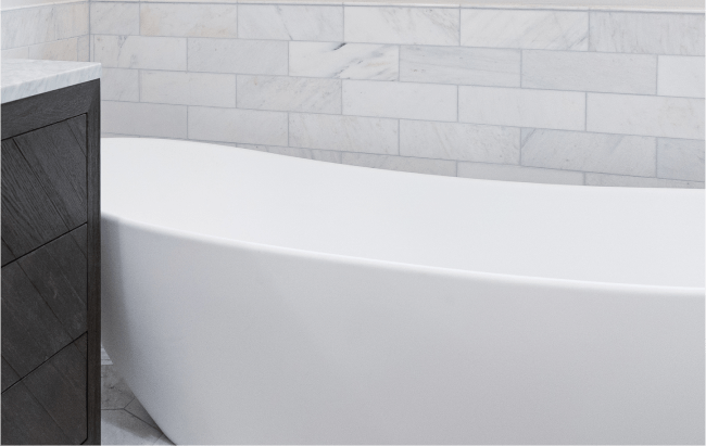
Think ahead as well. If you plan to refinish hardwood floors later, consider how that stain spectrum interacts with nearby grout. Wide-plank oak in a warm matte finish sits happily next to warm gray grout. Cool espresso floors next to a cool graphite grout can feel severe unless you soften the wall colors.
Sample stories that sharpen the choice
A couple on the North Side wanted a herringbone backsplash with 3 by 12 inch white subway. Their Pinterest board screamed black grout, but their kitchen had walnut cabinets and warm brass hardware. We tested a saturated charcoal and a smoky mid-gray. Under their pendants, the black read harsh. The smoky gray framed the pattern with a softness that fit the rest of the palette. Six months later, they emailed that cleaning was easy and the backsplash looked “finished, not fussy.” The urge for graphic contrast had been real, but the house asked for nuance.
In a master bath with 24 by 48 inch marble-look porcelain, we initially matched grout to the tile’s background white. On the wall, it was perfect. On the shower floor, smaller 2 by 2 inch cuts exaggerated the joints, and the match looked patchy once wet. We stepped to a soft vein-matching gray for the floor only. The change unified the pan and restored the slab-like wall effect without introducing a new color family.
When to break the rules
Occasionally, the grid is the point. In a midcentury kitchen with horizontal stacked tile, a strong grout contrast underlines the geometry and honors the period. In a contemporary loft with exposed brick and concrete, a deliberate dark joint across matte white tile can add structure amid all the texture.
There is also the charm of imperfect tile. Handmade, wavy edges deserve a quiet grout that lets light and shadow tell the story. But in a simple builder-grade ceramic, a slightly darker grout can add dimension without new material cost. It is a trick we use when the tile budget is tapped and the client still wants a tailored look.
Practical testing at home: a short checklist
Use this lightweight sequence to get 90 percent of the way there.
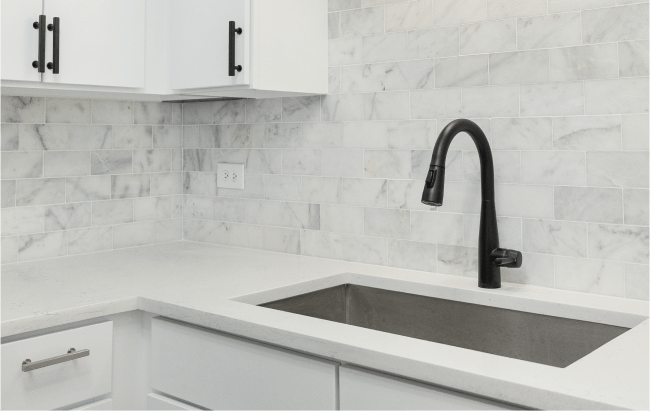

- Decide the outcome: seamless field, framed pattern, or graphic contrast. Identify the tile’s undertone with white and cream paper, then collect grout sticks that match it. Build a small mockup on a spare tile, using your actual joint width and layout. View the mockup under all lighting conditions you will use, and from 2 feet and 10 feet away. Sanity-check maintenance: picture real-life messes in your space, then adjust one shade toward forgiveness if needed.
Common mistakes that cost time or satisfaction
One repeat mistake is choosing grout from a catalog under cool showroom lights, then approving it for a warm-lit kitchen. Expect a temperature shift and always confirm on site. Another is chasing the perfect match on a heavily variegated tile. You will not match every pixel in a stone-look print, so match the average field tone and accept the natural variation.
A third mistake is changing grout color after installation because the first day’s haze made the joints look lighter. Fresh grout often appears chalky until the final clean. Cementitious grout can deepen a half shade as it cures. Wait for the post-grout clean before declaring it wrong.
How Revive 360 Renovations handles tricky transitions
Revive 360 Renovations on mixing tiles and grout across spaces
Many projects blend tile with hardwood, carpet, and stone. Transitions are where grout choices face their biggest test. If a kitchen floor tile abuts a hardwood dining room, we often tune the grout to a middle ground that neither fights the wood’s undertone nor looks dull against stainless appliances. On a recent project, the oak floor was finished in a satin natural tone. The porcelain had a cool gray cast. A neutral-warm mid-gray grout bridged both, and the threshold read intentional rather than accidental.
We also watch how grout interacts with accent strips, schluter trims, and bullnose edges. A bright white schluter next to an off-white grout can look mismatched. Either shift the grout to a true white or use a color-matched or stainless trim to avoid the near-miss.
Trends, timelessness, and how long a grout choice lasts
Design trends come and go. Very high contrast grout with classic white tile has cycled in and out of favor for decades. It photographs well, but it is less forgiving for cooks and families. Soft mid-tone grays, sand beiges, and tone-on-tone matches have staying power because they defer to the tile and the architecture. If you are balancing How to Plan a Home Renovation on a Budget with long-term satisfaction, a framed pattern approach usually satisfies both. You get definition without locking yourself to an edgy trend that might feel dated in three to five years.
Chicago home remodeling trends to watch in 2025 show a move toward organic modern palettes: clay, olive, bone, and charcoal. Grouts that echo those earthy undertones will sit comfortably next to textured plaster walls, light oak, and honed stone. If you are designing a family-friendly kitchen with durable surfaces, a warm gray grout across a creamy field tile can support that look without extra maintenance.
Technical notes that help installers succeed
Installers appreciate specificity. If you care about the exact shade, specify the brand, color code, grout type, and joint width in writing. Confirm whether the grout will be sealed, and with what product. Some sealers can slightly deepen the tone, particularly on unglazed tile where pore structure interacts with the sealer. Ask your installer for a small sealed test area on a spare tile before they proceed.
Grout haze removal influences perceived color. On matte tiles, haze can stubbornly linger and make joints appear lighter. A proper post-grout clean with the manufacturer-recommended cleaner, done after initial cure, restores the intended color. If you are living through a remodel and peeking in at 7 p.m. with work lights blazing, reserve judgment until the final clean and normal lighting.
Special cases: mosaics, patterns, and stone
Glass mosaics complicate grout because the joint color reflects through the glass. A high-contrast grout can tint the entire sheet. When we install glass, we almost always choose a grout that matches the average glass hue, then confirm with a grouted sample board. For patterned cement tile, the safest path is a grout that matches the tile’s lightest neutral tone. Anything darker can slice the motif into pieces.
Natural stone has pores that can absorb pigment from colored grout if not sealed. Pre-seal stone before grouting and use a grout with a color that will not highlight microscopic edge chipping. On honed marble, a very light warm gray grout often disappears, even if the stone has cool veining. That warmth hides edge softness and keeps the panel effect intact.
Bringing it all together with intent
Designers do not start with a grout fan deck. We start with the feeling the space should carry, then choose the tile, layout, joint width, grout type, and, finally, the color that completes the story. The color is the last mile, and it should serve the journey you have already defined. Make the decision where the tile will live, under the light it will see, with the messes it will fight.
If you want a rule of thumb that works more often than not, here it is. For walls, aim for a tone-on-tone match or a one-step framed pattern to keep focus on texture and light. For floors, choose a mid-tone that relates to the tile body and can absorb a week’s worth of life. For showers, be honest about water quality and sun exposure, then bias toward a forgiving shade that supports cleaning habits you will actually keep.
In our practice at Revive 360 Renovations, these principles have kept clients happy years after the last tile was set. We have revisited homes for new phases and seen grout choices that still feel right, not because they were trendy, but because they respected the material and the way people live. That, more than anything, is how to choose grout like a designer: with care for the details and a clear picture of the life that will unfold on those surfaces.